Candlestick Basics — Introduction
Candlesticks are the foundation of how we read the market. They show us not only where price moved, but also how buyers and sellers behaved during that movement. In this section, you will learn how to understand candles in the simplest way possible, even if you have never traded before. Step by step, you will move from basic candle meaning to understanding strength, emotion, and time inside the market.


What Is a Candlestick?
A candlestick is simply a way to show how price moved during a certain time. That time could be one minute, one hour, one day, or even one week. Each candlestick shows where the price started, where it went up to, where it dropped to, and where it finally closed. So with just one candlestick, you can understand the full story of what happened in the market during that time.
Candlesticks are better than bar charts because they are easier to read with your eyes. When you look at a candlestick, you can quickly understand if price moved strongly or weakly, fast or slow. You don’t need to analyze numbers. You can just see the movement clearly. This is why most professional traders around the world prefer candlesticks instead of simple lines or bars.
Every candlestick shows a fight between buyers and sellers. If the candle closes higher than it opened, that means buyers were stronger. If it closes lower, that means sellers were stronger. The bigger the candle body is, the stronger that side was. So when you look at candles, you are not just looking at price — you are watching who is winning the battle.
Candlesticks also show emotion in the market. Big candles usually mean excitement, fear, or strong decisions. Small candles usually mean confusion, hesitation, or balance between buyers and sellers. Long wicks show rejection, meaning the market tried to go higher or lower but failed. So candles don’t only show movement, they show feeling.
By understanding this, you are no longer just watching numbers on a screen. You are reading the behavior and emotion of the market.
Why Are Some Candles Green and Some Red?
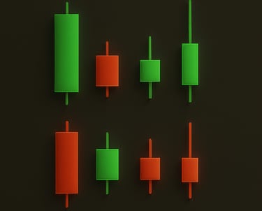
The color of a candlestick is simply telling you who won the battle during that time — the buyers or the sellers. When a candle is green, it means the price closed higher than it opened. In simple words, buyers were stronger and they pushed the price up. The market moved up during that time. When a candle is red, it means the price closed lower than it opened. This tells us that sellers were stronger and they pushed the price down. The market moved down during that time. So the color is not something complicated. Green means price went up, red means price went down.
You can think of it like this:
Green candles show buying pressure, and red candles show selling pressure. When you look at a chart, you are watching a conversation between buyers and sellers, and the candle color shows you who spoke louder.Once you understand this, charts stop looking confusing. You are no longer just seeing random movement — you are watching the story of strength and weakness unfolding in front of you.
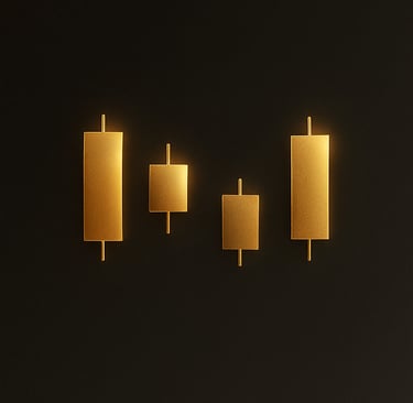
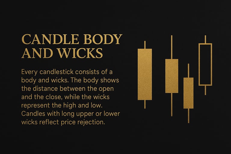
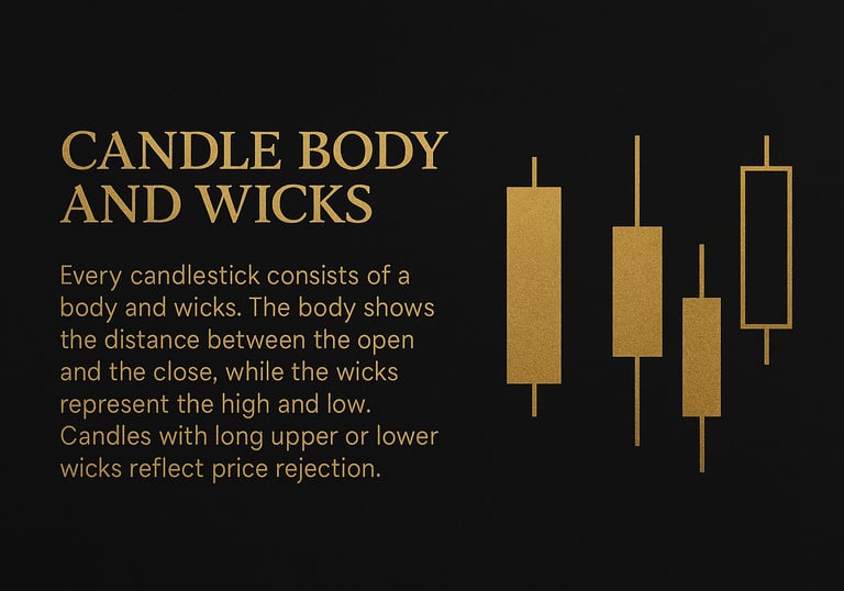
Candle Body and Wicks
Every candlestick is made of two main parts: the body and the wicks. The body is the thick part of the candle. It shows the important part of the price move, which is the distance between where price opened and where it closed. If the body is big, it means price moved strongly. If the body is small, it means price did not move much and the market was unsure.
The wicks are the thin lines above and below the body. The top wick shows how high price tried to go, and the bottom wick shows how low price tried to go. Wicks tell you about rejection. If a candle has a long top wick, it means price tried to go up but was pushed down by sellers. If it has a long bottom wick, it means price tried to go down but buyers pushed it back up.
You can think of the body as the final decision of the market, and the wicks as the failed attempts. The market often shows its true intention more clearly through the wicks than through the body alone.
When you start paying attention to the size of the body and the length of the wicks, you will begin to see when the market is confident and when it is unsure. This is one of the first steps to reading price like a professional, instead of guessing.

Bullish and Bearish Strength
When you look at a candlestick, one of the most important things you want to understand is strength. Strength means which side is winning — the buyers or the sellers. A bullish candle is a candle that closes higher than it opened. This means buyers were stronger during that time. A bearish candle is a candle that closes lower than it opened, which means sellers were stronger.
But strength is not only about the color of the candle. It is also about how big the candle is. A big bullish candle means buyers were very confident and strong. A small bullish candle means buyers won, but only with a little power. The same idea is true for bearish candles. A big bearish candle means sellers were strong and aggressive. A small one means sellers barely pushed price down.
You can think of this like pushing a door. If the door moves a lot, the push was strong. If it moves only a little, the push was weak. Candles work the same way. The bigger the candle body, the stronger the push.
When you start to read strength this way, you will stop guessing what the market might do. Instead, you will see what the market is actually doing. You will begin to understand when buyers are in control, when sellers are in control, and when neither side truly has power.
This is one of the most important skills in trading. Once you can see strength, you are no longer trading blindly. You are following the side that has real power.
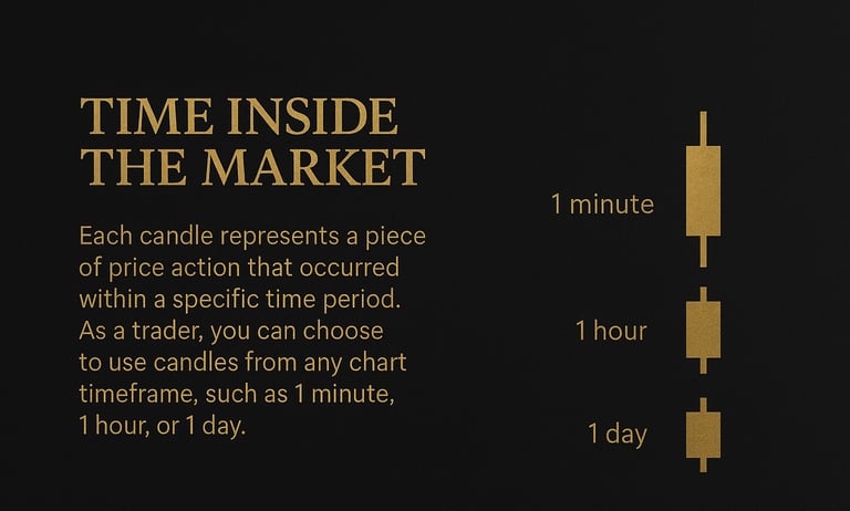
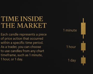
Candles and Timeframes
Every candlestick belongs to a timeframe. A timeframe simply means how much time one candle represents. For example, on a 1-minute chart, one candle shows one minute of price movement. On a 1-hour chart, one candle shows one hour. On a daily chart, one candle shows one full day of trading.
Even though the candle shape looks the same, its power is not the same. A single candle on a 1-minute chart is very small and weak compared to a candle on a daily or weekly chart. The higher the timeframe, the more important and more powerful the candle becomes. A daily candle shows the behaviour of the market over the whole day, so it carries much more meaning than a candle that only shows one minute.
This is why professional traders respect higher-timeframe candles more. A strong bullish candle on the weekly chart can control the market for many days or even weeks. But a strong candle on the 5-minute chart may only matter for a short time.
Timeframes also help you avoid confusion. If the market looks bullish on the daily chart but bearish on the 5-minute chart, the daily chart is more important. The higher timeframe is like the main road, and the lower timeframe is just small side streets.
When you understand how candles work across different timeframes, you stop getting trapped by small moves. You start to see the big picture first, and then you use small timeframes only for better timing. This is one of the first steps toward trading with confidence instead of emotion.